How to Match Carpet with Furniture and Decor
Choosing a carpet you love is only half the job, the real magic happens when it works seamlessly with your furniture, wall colours, and overall interior style. The wrong shade can clash with your décor or overpower the room, while the right choice can tie everything together, making your space feel balanced, inviting, and intentional.
From selecting a versatile neutral that works across multiple rooms, to using colour, texture, and pattern to complement your existing pieces, carpet selection should be guided by both design principles and personal taste. In this guide, we’ll share expert tips for matching your carpet to your furniture, walls, and décor style, helping you create a cohesive look that works in harmony from floor to ceiling.
Coordinating with Interior Elements
Matching with Wall Colours
A simple rule of thumb is to keep your carpet one or two shades lighter or darker than your wall colour for a balanced, layered look. If your walls are light, a slightly deeper carpet can help ground the space, while a pale carpet against darker walls can create contrast and lift the room.
Neutral wall colours like white, beige, or soft grey pair easily with a wide range of carpet tones - from warm oatmeal to cool slate - while more saturated wall colours benefit from softer, more muted carpet shades to avoid visual overload. Always test carpet samples against your walls in the actual room to see how lighting affects the combination throughout the day.
Colour Harmony and Contrast
Complementary Palettes
Complementary colours sit opposite each other on the colour wheel. For example, blue and orange, or green and red. When used thoughtfully, this contrast can make both colours appear more vibrant. In carpet selection, you can apply a softer version of this principle by pairing a muted carpet shade with décor in its complementary tone.
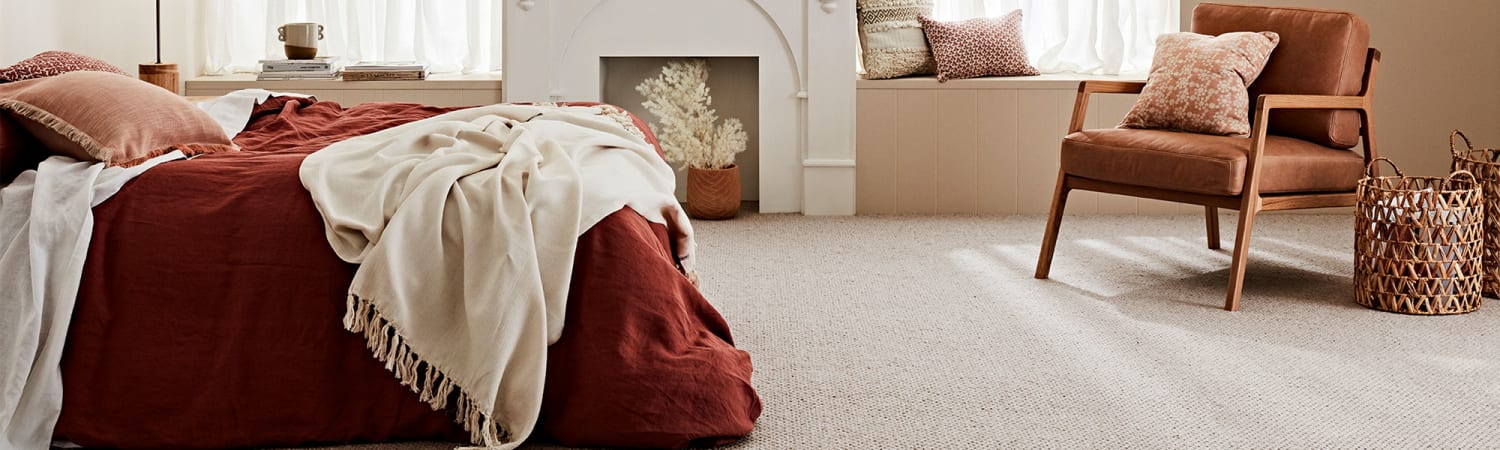
For instance, a warm taupe or terracotta carpet can beautifully offset cool-toned blue-grey walls, while a charcoal carpet can make warm-toned furniture fabrics pop. If you want a more subtle effect, opt for complementary colours in lower saturation (e.g., dusty blues with warm beige).
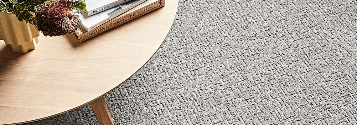
Monochromatic schemes, using variations of the same colour, are perfect for a cohesive, calming look. For example, pairing a pale dove-grey carpet with mid-grey walls and charcoal furniture creates depth while maintaining harmony.
Avoiding Visual Clashes
Too many competing colours or patterns can overwhelm a space. If your walls or furniture already feature bold patterns or vibrant tones, choose a carpet in a neutral or muted shade that balances the look.
Stick to a consistent undertone throughout the room, warm or cool, to keep the space feeling unified. For example, a cool grey carpet may clash with warm yellow-toned walls, while a warm beige carpet could feel out of place with crisp blue-grey accents.
If you’re working with strong statement colours, use the carpet as a grounding element. This could mean opting for earthy neutrals, heathered blends, or textured patterns that complement without competing.
Final Thoughts
Choosing the right carpet colour isn’t just about picking something you like in the showroom, it’s about finding a shade and style that works in harmony with your furniture, walls, and overall interior scheme. By keeping undertones consistent, balancing contrast with harmony, and considering how your flooring interacts with light, you can create a space that feels both cohesive and inviting.
Neutrals remain the most versatile option, working effortlessly across multiple styles and rooms, while bolder colours and patterns can inject personality when paired thoughtfully with simpler surroundings. Whether you opt for a carpet that blends seamlessly into your décor or one that stands out as a feature, the key is intentionality.
With the right balance of colour, texture, and placement, your carpet can anchor the room, unify the design, and enhance the atmosphere - turning your floor into one of the strongest elements of your home’s style story.